Προϊόντα
Επιλέξτε κατηγορία


Τρόφιμο για ειδικούς ιατρικούς σκοπούς (ισορροπημένη δίαιτα).
Για τη διαιτητική διαχείριση σε αδυναμία της ουροδόχου κύστης.
Βασικά συστατικά: εκχύλισμα σπόρων κολοκύθας, οξείδιο του μαγνησίου, εκχύλισμα εκουιζέτο, εκχύλισμα λιναρόσπορου, εκχύλισμα μπαχαρικού σουμάκι, εκχύλισμα σόγιας, πυρίτιο, ασκορβικό οξύ, εκχύλισμα λυκίσκου, χοληκαλσιφερόλη, μείγμα φυτικών εκχυλισμάτων
Αριθμός Γνωστοποίησης Ε.Ο.Φ.: 95130 / 12.10.2021
Το προϊόν δεν υπόκειται σε διαδικασία αδειοδότησης.


Προτείνεται για:
- Ενίσχυση των επιπέδων ενέργειας
- Ενίσχυση του ανοσοποιητικού συστήματος
- Ενίσχυση του οργανισμού κατά τη χειμερινή περίοδο και σε περιπτώσεις εποχικής γρίπης και κρυολογήματος
- Υποστήριξη του οργανισμού σε περιπτώσεις hangover και έντονης εξάντλησης
Αριθμός Γνωστοποίησης Ε.Ο.Φ.: 86763 / 04.08.2022
Το προϊόν δεν υπόκειται σε διαδικασία αδειοδότησης.


Προτείνεται για:
• τη διατροφική διαχείριση των συμπτωμάτων των εποχικών αλλεργιών
• την εποχική υποστήριξη του ανοσοποιητικού συστήματος
Αριθμός Γνωστοποίησης Ε.Ο.Φ.: 58441 / 31.05.2022
Το προϊόν δεν υπόκειται σε διαδικασία αδειοδότησης.


Προτείνεται για:
- την καθημερινή υποστήριξη του ανοσοποιητικού συστήματος
Αριθμός Γνωστοποίησης Ε.Ο.Φ.: 16221 / 14.02.2023
Το προϊόν δεν υπόκειται σε διαδικασία αδειοδότησης.


Τρόφιμο για ειδικούς ιατρικούς σκοπούς (ισορροπημένη δίαιτα).
Για τη διαιτητική διαχείριση σε φλεγμονώδεις ρευματικές παθήσεις.
Βασικά συστατικά: εκχύλισμα κουρκουμά, εκχύλισμα από κουκούτσια σταφυλιού, ασκορβικό οξύ, εκχύλισμα μποζουέλια, κιτρικά βιοφλαβονοειδή, οξική D-άλφα-τοκοφερόλη, εκχύλισμα ελαίου καρπών φοίνικα με τοκοφερόλες, τετραβορικό νάτριο, μείγμα φυτικών εκχυλισμάτων
Αριθμός Γνωστοποίησης Ε.Ο.Φ.: 79560 / 20.06.2019
Το προϊόν δεν υπόκειται σε διαδικασία αδειοδότησης.


Συμβάλλει:
- Στη μετατροπή των θρεπτικών συστατικών σε ενέργεια
- Στην προστασία της λειτουργίας των μιτοχονδρίων
- Στην παραγωγή ATP στο κύτταρο και ενισχύει τις διαδικασίες αντιγήρανσης και μεταβολισμού
- Στην διατήρηση της υγείας του κυττάρου και των ενεργειακών του επιπέδων
Αριθμός Γνωστοποίησης Ε.Ο.Φ.: 25620 / 17.03.2021
Το προϊόν δεν υπόκειται σε διαδικασία αδειοδότησης.


Προτείνεται για:
- Ενίσχυση του ανοσοποιητικού συστήματος
- Ενίσχυση της καρδιαγγειακής υγείας
- Αντιμικροβιακή / αντιβακτηριδιακή δράση
- Αντιικές / αντιφλεγμονώδεις ιδιότητες
- Αντιοξειδωτική δράση
- Υποστήριξη των φυσιολογικών επιπέδων της αρτηριακής πίεσης
Αριθμός Γνωστοποίησης Ε.Ο.Φ.: 40294 / 15.04.2022
Ο αριθμός γνωστοποίησης στον Ε.Ο.Φ. δεν επέχει θέση άδειας κυκλοφορίας του Ε.Ο.Φ.


Ιδανικό για:
• Άτομα με υψηλές πνευματικές απαιτήσεις
• Ενίσχυση της υψηλής απόδοσης των εγκεφαλικών λειτουργιών
• Περιπτώσεις πνευματικής κούρασης και εξασθενημένης μνήμης
Αριθμός Γνωστοποίησης Ε.Ο.Φ.: 58470 / 31.05.2022
Το προϊόν δεν υπόκειται σε διαδικασία αδειοδότησης.


Συμβάλλει:
- στη διατήρηση της υγείας των οστών
- στη διατήρηση της φυσιολογικής κατάστασης των δοντιών
- στη φυσιολογική λειτουργία των μυών
- στη διαχείριση οστεοπόρωσης και οστεοπενίας
Αριθμός Γνωστοποίησης Ε.Ο.Φ.: 95147 / 12.10.2021
Ο αριθμός γνωστοποίησης στον Ε.Ο.Φ. δεν επέχει θέση άδειας κυκλοφορίας του Ε.Ο.Φ.


Τρόφιμο για ειδικούς ιατρικούς σκοπούς (ισορροπημένη δίαιτα).
Για τη διαιτητική διαχείριση σε τριχόπτωση.
Βασικά συστατικά: σιτέλαιο, πεπτίδια κερατίνης, εκχύλισµα κεχριού, σύµπλεγµα τοκοτριενόλης / τοκοφερόλης, γλυκονικός ψευδάργυρος, D-παντοθενικό ασβέστιο, νικοτιναµίδιο, γλυκονικός χαλκός, L-κυστεΐνη, υδροχλωρική πυριδοξίνη, D-βιοτίνη
Αριθμός Γνωστοποίησης Ε.Ο.Φ.: 133415 / 17.12.2020
Το προϊόν δεν υπόκειται σε διαδικασία αδειοδότησης.


Τρόφιμο για ειδικούς ιατρικούς σκοπούς (ισορροπημένη δίαιτα).
Για τη διαιτητική διαχείριση σε υπερχοληστεριναιμία.
Βασικά συστατικά: φυτοστερόλες, κουερσετίνη, οξική D-άλφα-τοκοφερόλη, κιτρικά βιοφλαβονοειδή, βήτα καροτίνη, μείγμα εκχυλισμάτων
Αριθμός Γνωστοποίησης Ε.Ο.Φ.: 80979 / 06.08.2020
Το προϊόν δεν υπόκειται σε διαδικασία αδειοδότησης.


Προτείνεται για:
- Τις αντιβακτηριακές, αντιϊκές, αντιμυκητιακές ιδιότητες
- Τις αντιφλεγμονώδεις ιδιότητες
- Τη θωράκιση και ενίσχυση του ανοσοποιητικού συστήματος
- Τη διαχείριση των ιώσεων (εποχική γρίπη, κοινό κρυολόγημα κλπ)
Αριθμός Γνωστοποίησης Ε.Ο.Φ.: 45911 / 15.04.2019
Ο αριθμός γνωστοποίησης στον Ε.Ο.Φ. δεν επέχει θέση άδειας κυκλοφορίας του Ε.Ο.Φ.


Προτείνεται για:
- Ομαλή λειτουργία της καρδιάς και του κυκλοφορικού συστήματος
- Υποστήριξη των φυσιολογικών επιπέδων της αρτηριακής πίεσης
- Υψηλή αντιοξειδωτική δράση
- Ομαλή λειτουργία του εγκεφάλου και του νευρικού συστήματος
- Ενίσχυση της παραγωγής ενέργειας στον οργανισμό
Αριθμός Γνωστοποίησης Ε.Ο.Φ.: 63134 / 16.06.2020
Το προϊόν δεν υπόκειται σε διαδικασία αδειοδότησης.


Προτείνεται για:
- Ομαλή λειτουργία της καρδιάς και του κυκλοφορικού συστήματος
- Ομαλή λειτουργία του εγκεφάλου και του νευρικού συστήματος
- Ενίσχυση της παραγωγής ενέργειας στον οργανισμό
- Υψηλή αντιοξειδωτική δράση
- Διαχείριση αντιμετώπισης σε περιπτώσεις επιληψίας και της νόσου του Πάρκινσον
Αριθμός Γνωστοποίησης Ε.Ο.Φ.: 39090 / 02.04.2019
Το προϊόν δεν υπόκειται σε διαδικασία αδειοδότησης.


Προτείνεται για:
- Διατήρηση της υγείας του δέρματος, νυχιών, μαλλιών, τενόντων και αγγείων
- Μείωση εμφάνισης ρυτίδων
- Βελτίωση της ελαστικότητας του δέρματος
- Ενυδάτωση της επιδερμίδας
- Μείωση της κυτταρίτιδας
Αριθμός Γνωστοποίησης Ε.Ο.Φ.: 155151 / 11.12.2019
Ο αριθμός γνωστοποίησης στον Ε.Ο.Φ. δεν επέχει θέση άδειας κυκλοφορίας του Ε.Ο.Φ.


Υψηλής καθαρότητας διάλυμα κολλοειδούς χρυσού με υψηλό ποσοστό ενεργών ιόντων
Η καθαρότητα και η συγκέντρωση του προϊόντος έχουν ελεγχθεί και επιβεβαιωθεί από ανεξάρτητα εργαστήρια.
Συστατικά: νερό (aqua), κολλοειδής χρυσός (nano).


Υψηλής καθαρότητας διάλυμα κολλοειδούς αργύρου με υψηλό ποσοστό ενεργών ιόντων.
Η καθαρότητα και η συγκέντρωση του προϊόντος έχουν ελεγχθεί και επιβεβαιωθεί από ανεξάρτητα εργαστήρια.
Συστατικά: νερό (aqua), κολλοειδής άργυρος (nano).


Προτείνεται για:
- Ενίσχυση και εξισορρόπηση του ανοσοποιητικού συστήματος
- Αύξηση των επιπέδων αντοχής του οργανισμού
- Φυσική διαχείριση των συμπτωμάτων των αλλεργιών
- Τόνωση του οργανισμού
- Αντιϊκή και αντιβακτηριδιακή προστασία
- Αυξημένες αθλητικές επιδόσεις
- Υψηλή αντιγηραντική δράση (τελομεράση)
- Ενισχυμένη κάλυψη θρεπτικών αναγκών (παιδιά, τρίτη ηλικία)
Αριθμός Γνωστοποίησης Ε.Ο.Φ.: 97010 / 31.07.2019
Το προϊόν δεν υπόκειται σε διαδικασία αδειοδότησης.


Προτείνεται για:
- Ενίσχυση και εξισορρόπηση του ανοσοποιητικού συστήματος
- Αύξηση των επιπέδων αντοχής του οργανισμού
- Φυσική διαχείριση των συμπτωμάτων των αλλεργιών
- Τόνωση του οργανισμού
- Αντιϊκή και αντιβακτηριδιακή προστασία
- Αυξημένες αθλητικές επιδόσεις
- Υψηλή αντιγηραντική δράση (τελομεράση)
- Ενισχυμένη κάλυψη θρεπτικών αναγκών (παιδιά, τρίτη ηλικία)


Προτείνεται για:
- Απέκκριση / απομάκρυνση βαρέων μετάλλων και τοξινών από τον ανθρώπινο οργανισμό
- Διατήρηση γερών οστών και υγιούς καρδιαγγειακού συστήματος
- Υποστήριξη παραγωγής ενέργειας
Αριθμός Γνωστοποίησης Ε.Ο.Φ.: 8037 / 28.01.2022
Ο αριθμός γνωστοποίησης στον Ε.Ο.Φ. δεν επέχει θέση άδειας κυκλοφορίας του Ε.Ο.Φ.


Τρόφιμο για ειδικούς ιατρικούς σκοπούς (ισορροπημένη δίαιτα).
Για τη διαιτητική διαχείριση σε σακχαρώδη διαβήτη.
Βασικά συστατικά: εκχύλισμα πικρού πεπονιού, οξείδιο του μαγνησίου, εκχύλισμα τριγωνέλλας, εκχύλισμα άμλα, εκχύλισμα κανέλας, εκχύλισμα κουρκουμά, εκχύλισμα από κουκούτσια σταφυλιού, κιτρικός ψευδάργυρος, χοληκαλσιφερόλη, μονονιτρική θειαμίνη, τριχλωριούχο χρώμιο
Αριθμός Γνωστοποίησης Ε.Ο.Φ.: 80980 / 06.08.2020
Το προϊόν δεν υπόκειται σε διαδικασία αδειοδότησης.


Συνίσταται για:
- Περιπτώσεις τυμπανισμού, δυσπεψίας, καούρας
- Καλύτερη αποδόμηση της τροφής
- Βελτιστοποίηση της πεπτικής διαδικασίας στο στομάχι
Αριθμός Γνωστοποίησης Ε.Ο.Φ.: 16225 / 14.02.2023
Το προϊόν δεν υπόκειται σε διαδικασία αδειοδότησης.


Τρόφιμο για ειδικούς ιατρικούς σκοπούς (ισορροπημένη δίαιτα).
Για τη διαιτητική διαχείριση σε σύνδρομο ευερέθιστου εντέρου με συμπτώματα όπως φούσκωμα, κοιλιακό άλγος, διάρροια, δυσκοιλιότητα.
Βασικά συστατικά: μείγμα εκχυλισμάτων (χαμομήλι, μέντα, αγριοκύμινο, γκρέιπφρουτ, γλυκόριζα, κόλιανδρος, κάρδαμο, μάραθος, γλυκάνισος, μαύρο κύμινο, κύμινο, κουρκουμάς, τζίντζερ, δενρολίβανο, αγκινάρα), μείγμα μπιφιντοβακτηρίων (Bifidobacterium bifidum, Bifidobacterium animalis, Bifidobacterium longum), Bacillus Subtilis
Αριθμός Γνωστοποίησης Ε.Ο.Φ.: 80982 / 06.08.2020
Το προϊόν δεν υπόκειται σε διαδικασία αδειοδότησης.


Φαρμακευτικού βαθμού καθαρότητας (EP GRADE)
Χωρίς προσμείξεις – χωρίς αλουμίνιο, χωρίς συντηρητικά, χωρίς γλουτένη!
Ειδικά ελεγμένο για αλλεργιογόνα
Χωρίς γενετικά τροποποιημένες ύλες και συστατικά


Συμβάλλει στη διαχείριση:
• Της ηπατοτοξικότητας
• Της εξισορρόπησης του μικροβιώματος
• Της καταπολέμησης παθογόνων βακτηρίων
• Των ομαλών επιπέδων γλυκόζης
• Των λιπιδίων
• Της ανοσοαπόκρισης
Αριθμός Γνωστοποίησης Ε.Ο.Φ.: 126407 / 15.12.2021
Ο αριθμός γνωστοποίησης στον Ε.Ο.Φ. δεν επέχει θέση άδειας κυκλοφορίας του Ε.Ο.Φ.


Τρόφιμο για ειδικούς ιατρικούς σκοπούς (ισορροπημένη δίαιτα).
Για τη διαιτητική διαχείριση σε παθήσεις των φλεβών των ποδιών (χρόνια φλεβική ανεπάρκεια).
Βασικά συστατικά: οξείδιο του μαγνησίου, εκχύλισμα φλοιού πεύκου (95% OPC), εκχύλισμα ιπποκαστανιάς, εκχύλισμα φύλλων ελιάς, κιτρικά βιοφλαβονοειδή, εκχύλισμα ιαπωνικής σοφόρας, χοληκαλσιφερόλη, μενακινόνη-7, φυλλικό οξύ
Αριθμός Γνωστοποίησης Ε.Ο.Φ.: 79557 / 20.06.2019
Το προϊόν δεν υπόκειται σε διαδικασία αδειοδότησης.


Προτείνεται για:
- Περιόδους εγκυμοσύνης και θηλασμού
- Άτομα με αναιμία
- Παραγωγή ερυθρών αιμοσφαιρίων
- Ομαλή καρδιαγγειακή λειτουργία
- Ενίσχυση της γονιμότητας
Αριθμός Γνωστοποίησης Ε.Ο.Φ.: 119958 / 08.10.2019
Ο αριθμός γνωστοποίησης στον Ε.Ο.Φ. δεν επέχει θέση άδειας κυκλοφορίας του Ε.Ο.Φ.

Προτείνεται για:
- Διαχείριση του στρες και του άγχους
- Διευκόλυνση του ύπνου
- Υγιή λειτουργία του νευρικού συστήματος
Αριθμός Γνωστοποίησης Ε.Ο.Φ.: 29980 / 27.03.2023
Το προϊόν δεν υπόκειται σε διαδικασία αδειοδότησης.
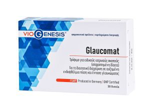

Τρόφιμο για ειδικούς ιατρικούς σκοπούς (ισορροπημένη δίαιτα).
Για τη διαιτητική διαχείριση σε αυξημένη ενδοφθάλμια πίεση και ένταση γλαυκώματος.
Βασικά συστατικά: εκχύλισμα ιαπωνικής σοφόρας, εκχύλισμα μύρτιλου, νιασίνη, εκχύλισμα φλοιού πεύκου, εκχύλισμα γκίνγκο μπιλόμπα, κυανοκοβαλαμίνη, υδροχλωρική πυριδοξίνη, εκχύλισμα σαφράν, φυλλικό οξύ
Αριθμός Γνωστοποίησης Ε.Ο.Φ.: 97011 / 31.07.2019
Το προϊόν δεν υπόκειται σε διαδικασία αδειοδότησης.


Προτείνεται για:
- Ενίσχυση και εξισορρόπηση του ανοσοποιητικού συστήματος
- Αύξηση των επιπέδων αντοχής του οργανισμού
- Φυσική διαχείριση των συμπτωμάτων των αλλεργιών
- Τόνωση του οργανισμού
- Αντιϊκή και αντιβακτηριδιακή προστασία
- Αυξημένες αθλητικές επιδόσεις
- Υψηλή αντιγηραντική δράση (τελομεράση)
- Ενισχυμένη κάλυψη θρεπτικών αναγκών (παιδιά, τρίτη ηλικία)
Αριθμός Γνωστοποίησης Ε.Ο.Φ.: 8036 / 28.01.2022
Ο αριθμός γνωστοποίησης στον Ε.Ο.Φ. δεν επέχει θέση άδειας κυκλοφορίας του Ε.Ο.Φ.


Προτείνεται για:
- Αλλοιώσεις του δέρματος και μικρές πληγές
- Πνευματικό στρες και διαταραχές της ψυχικής διάθεσης
- Διαταραχές του γαστρεντερικού συστήματος
Αριθμός Γνωστοποίησης Ε.Ο.Φ.: 25381 / 16.03.2021
Ο αριθμός γνωστοποίησης στον Ε.Ο.Φ. δεν επέχει θέση άδειας κυκλοφορίας του Ε.Ο.Φ.


Συμβάλλει:
- στη φυσιολογική παραγωγή θυρεοειδικών ορμονών και στη φυσιολογική θυρεοειδική λειτουργία
- στη διατήρηση της φυσιολογικής κατάστασης του δέρματος
- στη φυσιολογική λειτουργία του νευρικού συστήματος
- στη φυσιολογική λειτουργία των μεταβολικών διεργασιών που αποσκοπούν στην παραγωγή ενέργειας
- στη φυσιολογική γνωσιακή λειτουργία
Αριθμός Γνωστοποίησης Ε.Ο.Φ.: 25470 / 10.03.2022
Ο αριθμός γνωστοποίησης στον Ε.Ο.Φ. δεν επέχει θέση άδειας κυκλοφορίας του Ε.Ο.Φ.


Τρόφιμο για ειδικούς ιατρικούς σκοπούς (ισορροπημένη δίαιτα).
Για τη διαιτητική διαχείριση σε παθήσεις των αρθρώσεων (αρθροπάθεια).
Βασικά συστατικά: σκόνη από μεμβράνη κελύφους αυγών, ασκορβικό οξύ, μη μετουσιωμένο κολλαγόνο τύπου ΙΙ, εκχύλισμα boswellia serrata, τετραβορικό νάτριο, χοληκαλσιφερόλη
Αριθμός Γνωστοποίησης Ε.Ο.Φ.: 25390 / 16.03.2021
Το προϊόν δεν υπόκειται σε διαδικασία αδειοδότησης.


Παρέχει:
- Ομαλή λειτουργία του μυοσκελετικού συστήματος
- Υποστήριξη της λειτουργίας των αρθρώσεων και των συνδέσμων
- Φυσική αντιφλεγμονώδη δράση
- Φυσική υποστήριξη και ενίσχυση του χόνδρου των αρθρώσεων
Αριθμός Γνωστοποίησης Ε.Ο.Φ.: 44444 / 16.04.2020
Το προϊόν δεν υπόκειται σε διαδικασία αδειοδότησης.


Τρόφιμο για ειδικούς ιατρικούς σκοπούς (ισορροπημένη δίαιτα).
Για τη διαιτητική διαχείριση σε χρόνια κόπωση.
Βασικά συστατικά: τρυγική καρνιτίνη, εκχύλισμα ροδιόλα, συνένζυμο Q10, εκχύλισμα γκρέιπφρουτ, κυανοκοβαλαμίνη, β-νικοτιναμιδο-αδενινο-δινουκλεοτίδιο, μείγμα φυτικών εκχυλισμάτων
Αριθμός Γνωστοποίησης Ε.Ο.Φ.: 95136 / 12.10.2021
Το προϊόν δεν υπόκειται σε διαδικασία αδειοδότησης.


Προτείνεται για:
- Φυσιολογική καρδιακή λειτουργία
- Ενίσχυση των εγκεφαλικών λειτουργιών
- Έλεγχο ισορροπίας των τριγλυκεριδίων
- Μείωση των φλεγμονών των αρθρώσεων
- Φυσική αντιοξειδωτική προστασία
Αριθμός Γνωστοποίησης Ε.Ο.Φ.: 79559 / 20.06.2019
Το προϊόν δεν υπόκειται σε διαδικασία αδειοδότησης.


Συμβάλλει:
- Στην ομαλή λειτουργία του καρδιαγγειακού συστήματος
- Στη μείωση του χρόνου επούλωσης των τραυματισμών (ιδίως των οστών)
- Στη μείωση του χρόνου επιδιόρθωσης των κατετραμμένων ιστών
- Στην αύξηση της μυϊκής μάζας
- Στον καλύτερο μεταβολισμό του λίπους
Αριθμός Γνωστοποίησης Ε.Ο.Φ.: 36397 / 20.03.2020
Ο αριθμός γνωστοποίησης στον Ε.Ο.Φ. δεν επέχει θέση άδειας κυκλοφορίας του Ε.Ο.Φ.


Προτείνεται για:
• Αύξηση των επιπέδων ενέργειας
• Βελτίωση των αθλητικών αποδόσεων και της αντοχής
• Ενίσχυση του καρδιαγγειακού συστήματος
• Ενίσχυση της μνήμης
Αριθμός Γνωστοποίησης Ε.Ο.Φ.: 58487 / 31.05.2022
Το προϊόν δεν υπόκειται σε διαδικασία αδειοδότησης.

Συμβάλλει:
- Στην αύξηση της μυϊκής μάζας και στον ενεργειακό μεταβολισμό
- Στην υγεία του πεπτικού συστήματος
- Στη διατήρηση της υγείας του κεντρικού νευρικού συστήματος
- Στην ομαλή λειτουργία του ανοσοποιητικού συστήματος
Αριθμός Γνωστοποίησης Ε.Ο.Φ.: 90026 / 15.07.2019
Ο αριθμός γνωστοποίησης στον Ε.Ο.Φ. δεν επέχει θέση άδειας κυκλοφορίας του Ε.Ο.Φ.


Προτείνεται για:
- Ενίσχυση του ανοσοποιητικού συστήματος
- Περιπτώσεις έρπητα και αυτοάνοσα νοσήματα
- Εποχική γρίπη και κοινό κρυολόγημα
Αριθμός Γνωστοποίησης Ε.Ο.Φ.: 36398 / 20.03.2020
Το προϊόν δεν υπόκειται σε διαδικασία αδειοδότησης.


Προτείνεται για:
- Εύρυθμη λειτουργία των διεργασιών του οργανισμού
- Εύρυθμη μυϊκή λειτουργία
- Ανακούφιση από κράμπες
- Άτομα που αθλούνται συστηματικά
- Ρύθμιση καρδιακών παλμών και καρδιαγγειακής λειτουργίας
- Αντιμετώπιση ημικρανιών
Αριθμός Γνωστοποίησης Ε.Ο.Φ.: 45915 / 15.04.2019
Το προϊόν δεν υπόκειται σε διαδικασία αδειοδότησης.


Προτείνεται για:
- Δυσκοιλιότητα
- Αποτελεσματικό καθαρισμό της εντερικής οδού
- Ομαλή λειτουργία κένωσης του εντέρου
Αριθμός Γνωστοποίησης Ε.Ο.Φ.: 40296 / 15.04.2022
Το προϊόν δεν υπόκειται σε διαδικασία αδειοδότησης.
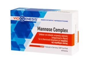

Τρόφιμο για ειδικούς ιατρικούς σκοπούς (ισορροπημένη δίαιτα).
Για τη διαιτητική διαχείριση σε λοιμώξεις της ουροδόχου κύστης.
Βασικά συστατικά: D-μαννόζη, εκχύλισμα κράνμπερι, L-μεθειονίνη, εκχύλισμα μπλέ μούρων, εκχύλισμα πικραλίδας, σκόνη μούρων αρκοστάφυλλου, σκόνη χρυσόβεργας, εκχύλισμα από χυμό μαϊντανού, εκχύλισμα σπόρων κολοκύθας
Αριθμός Γνωστοποίησης Ε.Ο.Φ.: 579 / 07.01.2021
Το προϊόν δεν υπόκειται σε διαδικασία αδειοδότησης.


Προτείνεται για:
- Αϋπνία
- Διάφορες διαταραχές του ύπνου (jet lag)
- Ορμονικές διαταραχές, μετά από σύσταση του θεράποντος γιατρού
Αριθμός Γνωστοποίησης Ε.Ο.Φ.: 22388 / 02.03.2022
Το προϊόν δεν υπόκειται σε διαδικασία αδειοδότησης.
Παρέχει:
- Φυσική παυσίπονη δράση
- Φυσική αντιφλεγμονώδη δράση
- Σωστή διατήρηση της υγείας των αρθρώσεων και των χόνδρων
Αριθμός Γνωστοποίησης Ε.Ο.Φ.: 133450 / 17.12.2020
Ο αριθμός γνωστοποίησης στον Ε.Ο.Φ. δεν επέχει θέση άδειας κυκλοφορίας του Ε.Ο.Φ.


Προτείνεται για:
- Την υποστήριξη του ανοσοποιητικού συστήματος
- Την καρδιαγγειακή υγεία
- Τη μείωση της χοληστερόλης
- Τον έλεγχο του σακχάρου στο αίμα
- Τις αντιοξειδωτικές του ιδιότητες
Αριθμός Γνωστοποίησης Ε.Ο.Φ.: 127666 / 23.11.2023
Το προϊόν δεν υπόκειται σε διαδικασία αδειοδότησης.


Συµβάλλει:
• στην προστασία καρδιαγγειακής λειτουργίας
• στη βελτιστοποίηση της κυκλοφορίας του αίµατος
• στη διαχείριση των λιπιδίων
• στη φυσιολογική πήξη του αίµατος
Αριθμός Γνωστοποίησης Ε.Ο.Φ.: 67590 / 14.07.2021
Το προϊόν δεν υπόκειται σε διαδικασία αδειοδότησης.


Τρόφιμο για ειδικούς ιατρικούς σκοπούς (ισορροπημένη δίαιτα).
Για τη διαιτητική διαχείριση σε παθήσεις της ωχράς κηλίδας (εκφύλιση της ωχράς κηλίδας).
Βασικά συστατικά: ασκορβικό οξύ, εκχύλισμα κατιφέ, ρεσβερατρόλη, οξική DL-άλφα-τοκοφερόλη, εκχύλισμα σπόρων σταφυλιού (95% OPC), τριχλωριούχο χρώμιο, σεληνιακό νάτριο, οξείδιο του ψευδαργύρου, οξική ρετινόλη, κυανοκοβαλαμίνη, νικοτιναμίδιο, D-παντοθενικό ασβέστιο, υδροχλωρική πυριδοξίνη, υδροχλωρική θειαμίνη, χοληκαλσιφερόλη, ριβοφλαβίνη, φυλλικό οξύ, βιοτίνη
Αριθμός Γνωστοποίησης Ε.Ο.Φ.: 79561 / 20.06.2019
Το προϊόν δεν υπόκειται σε διαδικασία αδειοδότησης.

Προτείνεται για:
- Ομαλή λειτουργία του καρδιαγγειακού συστήματος
- Ενίσχυση της εγκεφαλικής λειτουργίας
- Υγιή όραση
- Διατήρηση των φυσιολογικών επιπέδων της χοληστερίνης και της αρτηριακής πίεσης
Αριθμός Γνωστοποίησης Ε.Ο.Φ.: 44852 / 29.04.2022
Ο αριθμός γνωστοποίησης στον Ε.Ο.Φ. δεν επέχει θέση άδειας κυκλοφορίας του Ε.Ο.Φ.


Συνίσταται για:
- Φυσιολογική γαστρεντερική λειτουργία
- Ισορροπία και προστασία της εντερικής χλωρίδας
- Συγχορήγηση με αντιβιοτικά φάρμακα
- Ενίσχυση του ανοσοποιητικού συστήματος
Αριθμός Γνωστοποίησης Ε.Ο.Φ.: 59931 / 13.05.2019
Ο αριθμός γνωστοποίησης στον Ε.Ο.Φ. δεν επέχει θέση άδειας κυκλοφορίας του Ε.Ο.Φ.


Συμβάλλει:
- Στην αναστολή των διαδικασιών της κυτταρικής γήρανσης
- Στη μείωση του ρίσκου εμφάνισης μεταβολικών, νευροεκφυλιστικών και καρδιαγγειακών παθήσεων που σχετίζονται με κυτταρική γήρανση
- Στη διαχείριση της αντίστασης στην ινσουλίνη
- Στη διαχείριση του σωματικού βάρους
Αριθμός Γνωστοποίησης Ε.Ο.Φ.: 126405 / 15.12.2021
Το προϊόν δεν υπόκειται σε διαδικασία αδειοδότησης.


Συνίσταται για:
• Φυσιολογική γαστρεντερική λειτουργία
• Ισορροπία και προστασία της εντερικής χλωρίδας
• Συγχορήγηση με αντιβιοτικά φάρμακα
• Ενίσχυση του ανοσοποιητικού συστήματος
Αριθμός Γνωστοποίησης Ε.Ο.Φ.: 40765 / 05.05.2021
Ο αριθμός γνωστοποίησης στον Ε.Ο.Φ. δεν επέχει θέση άδειας κυκλοφορίας του Ε.Ο.Φ.


Τρόφιμο για ειδικούς ιατρικούς σκοπούς (ισορροπημένη δίαιτα).
Για τη διαιτητική διαχείριση σε θεραπείες της κάντιντα, της περιοδοντίτιδας και των φλεγμονών του στοματικού βλεννογόνου.
Βασικά συστατικά: μείγμα φιλικών βακτηρίων (Lactobacillus reuteri, Lactobacillus paracasei, Lactobacillus casei, Lactobacillus rhamnosus, Lactobacillus salivarius, Lactobacillus acidophilus, Lactobacillus fermentum, Bifidobacterium bifidum, Bifidobacterium lactis), Bacillus subtilis, χοληκαλσιφερόλη
Αριθμός Γνωστοποίησης Ε.Ο.Φ.: 29983 / 27.03.2023
Το προϊόν δεν υπόκειται σε διαδικασία αδειοδότησης.


Τρόφιμο για ειδικούς ιατρικούς σκοπούς (ισορροπημένη δίαιτα).
Για τη διαιτητική διαχείριση σε καλοήθη υπερπλασία του προστάτη.
Βασικά συστατικά: εκχύλισμα τσουκνίδας, σύμπλεγμα φυτοστερολών (98%), εκχύλισμα σπόρων κολοκύθας, εκχύλισμα τομάτας (10% λυκοπένιο), εκχύλισμα μπρόκολου, εκχύλισμα ροδιού, L-ιστιδίνη, χοληκαλσιφερόλη, κιτρικός ψευδάργυρος, τετραβορικό νάτριο, μείγμα φυτικών εκχυλισμάτων
Αριθμός Γνωστοποίησης Ε.Ο.Φ.: 15292 / 11.02.2019
Το προϊόν δεν υπόκειται σε διαδικασία αδειοδότησης.


Προτείνεται για:
- Διατήρηση υγιών επιπέδων σακχάρου στο αίμα
- Ισχυρή αντιοξειδωτική δράση
- Άτομα με διαβητική νευροπάθεια, μετά από σύσταση του θεράποντος γιατρού
Αριθμός Γνωστοποίησης Ε.Ο.Φ.: 53806 / 22.05.2023
Το προϊόν δεν υπόκειται σε διαδικασία αδειοδότησης.


Προτείνεται για:
- Διατήρηση και έλεγχο του σωματικού βάρους
- Διαχείριση των υγειών επιπέδων χοληστερόλης
- Τόνωση του νευρικού συστήματος
- Ενίσχυση της υγιούς λειτουργίας των εγκεφαλικών και νευρικών διεργασιών


Προτείνεται για:
- Αντιγηραντική δράση
- Ενίσχυση της ελαστικότητας του δέρματος
- Φυσική ισχυρή αντιοξειδωτική δράση (ήπαρ)
- Αποτοξίνωση από βαρεά μέταλλα
Αριθμός Γνωστοποίησης Ε.Ο.Φ.: 133456 / 17.12.2020
Ο αριθμός γνωστοποίησης στον Ε.Ο.Φ. δεν επέχει θέση άδειας κυκλοφορίας του Ε.Ο.Φ.


Προτείνεται για:
- Καλύτερη διαχείριση ψυχολογικών μεταπτώσεων και άγχους
- Διάφορες διαταραχές του ύπνου
- Καλύτερη ηπατική λειτουργία
- Μείωση πόνων νευρικής φύσεως
Αριθμός Γνωστοποίησης Ε.Ο.Φ.: 581 / 07.01.2021
Το προϊόν δεν υπόκειται σε διαδικασία αδειοδότησης.


Συμβάλλει:
- Στη φυσιολογική σπερματογένεση
- Στη φυσιολογική λειτουργία του ανοσοποιητικού συστήματος
- Στη φυσιολογική θυρεοειδική λειτουργία
- Στην προστασία των κυττάρων από το οξειδωτικό στρες
Αριθμός Γνωστοποίησης Ε.Ο.Φ.: 37173 / 21.04.2021
Το προϊόν δεν υπόκειται σε διαδικασία αδειοδότησης.


Τρόφιμο για ειδικούς ιατρικούς σκοπούς (ισορροπημένη δίαιτα).
Για τη διαιτητική διαχείριση σε διαγνωσμένη σιδηροπενική αναιμία.
Βασικά συστατικά: 50% λακτοφερίνη από αγελαδινό γάλα
Αριθμός Γνωστοποίησης Ε.Ο.Φ.: 40297 / 15.04.2022
Το προϊόν δεν υπόκειται σε διαδικασία αδειοδότησης.


Διττανθρακική σόδα απαλλαγμένη από αλουμίνιο και γλουτένη. Χωρίς προσμείξεις.
Φαρμακευτικού βαθμού καθαρότητας (EP GRADE).
Προέλευση: Γερμανία
Κατάλληλη και για μαγειρική χρήση.
Μπορεί να χρησιμοποιηθεί για την υγιεινή των δοντιών και άλλες χρήσεις προσωπικής φροντίδας.


Συμβάλλει:
- Στην υγιή λειτουργία των οστών και των αρθρώσεων, παρέχοντας φυσική αντιφλεγμονώδη και παυσίπονη δράση
- Στη φυσιολογική λειτουργία του ανοσοποιητικού συστήματος
- Στη βελτίωση της διαδικασίας της πέψης
- Στη φυσική αποτοξίνωση του οργανισμού, παρέχοντας αντιοξειδωτική προστασία
Αριθμός Γνωστοποίησης Ε.Ο.Φ.: 50439 / 11.05.2020
Ο αριθμός γνωστοποίησης στον Ε.Ο.Φ. δεν επέχει θέση άδειας κυκλοφορίας του Ε.Ο.Φ.


Υποστηρίζει:
- Τα υγιή επίπεδα οξυγόνου στον οργανισμό
- Την κυτταρική λειτουργία
- Τον υγιή μεταβολισμό
- Την γρήγορη αποκατάσταση μετά από έντονη άσκηση (post-workout) ή έντονη ψυχοσωματική καταπόνηση
- Την διαδικασία παραγωγής ενέργειας
Αριθμός Γνωστοποίησης Ε.Ο.Φ.: 41780 / 07.05.2021
Ο αριθμός γνωστοποίησης στον Ε.Ο.Φ. δεν επέχει θέση άδειας κυκλοφορίας του Ε.Ο.Φ.


Προτείνεται για:
- Αντιοξειδωτική δράση
- Υποστήριξη της ομαλής καρδιακής λειτουργίας
- Ενίσχυση της κυτταρικής παραγωγής ενέργειας στην καρδιά, τον εγκέφαλο και τον μυϊκό ιστό
- Υποστήριξη των φυσιολογικών επιπέδων της αρτηριακής πίεσης
Αριθμός Γνωστοποίησης Ε.Ο.Φ.: 67587 / 14.07.2021
Το προϊόν δεν υπόκειται σε διαδικασία αδειοδότησης.


Τρόφιμο για ειδικούς ιατρικούς σκοπούς (ισορροπημένη δίαιτα).
Για τη διαιτητική διαχείριση σε κολπική ατροφία.
Βασικά συστατικά: έλαιο ιπποφαούς, εκχύλισμα τριγωνέλλας, εκχύλισμα διοσκορέας, εκχύλισμα κόκκινου τριφυλλιού, εκχύλισμα ροντιόλα, εκχύλισμα γκότου κόλα, εκχύλισμα σισάνδρα, εκχύλισμα ροδιού, εκχύλισμα νταμιάνα, ασκορβικό οξύ, νικοτιναμίδιο, κιτρικός ψευδάργυρος, οξική D-άλφα-τοκοφερόλη, βήτα καροτίνη, ριβοφλαβίνη, βιοτίνη
Αριθμός Γνωστοποίησης Ε.Ο.Φ.: 25378 / 16.03.2021
Το προϊόν δεν υπόκειται σε διαδικασία αδειοδότησης.


Τρόφιµο για ειδικούς ιατρικούς σκοπούς (ισορροπηµένη δίαιτα).
Για τη διαιτητική διαχείριση σε παθήσεις της σπονδυλικής στήλης, αλγαισθητικές παθήσεις, νευραλγία (νευροπαθητικοί πόνοι) και πολυνευροπάθεια σε συνδυασμό με βλάβη του περιφερικού νευρικού συστήματος.
Βασικά συστατικά Day: μονοφωσφορική ουριδίνη, κυανοκοβαλαμίνη, μονοφωσφορική κυτιδίνη, μονοφωσφορική γουανοσίνη, μονοφωσφορική αδενοσίνη, λακτοφερίνη, φυλλικό οξύ
Βασικά συστατικά Night: μονοφωσφορική ουριδίνη, κυανοκοβαλαμίνη, μονοφωσφορική κυτιδίνη, μονοφωσφορική γουανοσίνη, μονοφωσφορική αδενοσίνη, λακτοφερίνη, εκχύλισμα λεβάντας, υδροχλωρική πυριδοξίνη, μελατονίνη, φυλλικό οξύ
Αριθμός Γνωστοποίησης Ε.Ο.Φ.: 138233 / 09.12.2022
Το προϊόν δεν υπόκειται σε διαδικασία αδειοδότησης.


Τρόφιμο για ειδικούς ιατρικούς σκοπούς (ισορροπημένη δίαιτα).
Για τη διαιτητική διαχείριση σε οπτική κόπωση (καταπόνηση των ματιών, υπερκόπωση των ματιών).
Βασικά συστατικά: εκχύλισμα μύρτιλου, εκχύλισμα Haematococcus pluvialis, εκχύλισμα καλέντουλας, μείγμα φυτικών εκχυλισμάτων
Αριθμός Γνωστοποίησης Ε.Ο.Φ.: 79560 / 20.06.2019
Το προϊόν δεν υπόκειται σε διαδικασία αδειοδότησης.


Συμβάλλει:
- Στην παραγωγή ενέργειας
- Στην ομαλή λειτουργία του μεταβολισμού
- Στη φυσιολογική ορμονική ισορροπία
- Στη φυσιολογική λειτουργία του νευρικού συστήματος
- Στη φυσιολογική εγκεφαλική λειτουργία και βελτιωμένη γνωστική διαδικασία
- Στην καλύτερη διαχείριση του άγχους, του στρες και της κατάθλιψης
Αριθμός Γνωστοποίησης Ε.Ο.Φ.: 37174 / 21.04.2021
Ο αριθμός γνωστοποίησης στον Ε.Ο.Φ. δεν επέχει άδειας κυκλοφορίας του Ε.Ο.Φ.


Συμβάλλει:
- Στην παραγωγή ενέργειας
- Στη φυσιολογική λειτουργία του νευρικού συστήματος
- Στην καλύτερη διαχείριση του άγχους, του στρες και της κατάθλιψης
- Στην υγιή λειτουργία του εγκεφάλου
- Στο φυσιολογικό σχηματισμό ερυθρών αιμοσφαιρίων
- Στη φυσιολογική λειτουργία του ανοσοποιητικού συστήματος
- Στη μείωση της κούρασης και της κόπωσης
Αριθμός Γνωστοποίησης Ε.Ο.Φ.: 119957 / 08.10.2019
Ο αριθμός γνωστοποίησης στον Ε.Ο.Φ. δεν επέχει θέση άδειας κυκλοφορίας του Ε.Ο.Φ.


Συμβάλλει:
- Στη φυσιολογική λειτουργία του ανοσοποιητικού συστήματος
- Στην προστασία των κυττάρων από το οξειδωτικό στρες
- Στην αύξηση της απορρόφησης του σιδήρου
- Στη φυσιολογική λειτουργία του νευρικού συστήματος
- Στη μείωση της κόπωσης
- Στην αύξηση απορρόφησης κολλαγόνου
Αριθμός Γνωστοποίησης Ε.Ο.Φ.: 63258 / 16.06.2020
Ο αριθμός γνωστοποίησης στον Ε.Ο.Φ. δεν επέχει θέση άδειας κυκλοφορίας του Ε.Ο.Φ.


Συμβάλλει:
- Στην αντιοξειδωτική προστασία
- Στην ενίσχυση του ανοσοποιητικού συστήματος
- Στη φυσιολογική θωράκιση του οργανισμού από μολύνσεις και ιώσεις, ειδικά του αναπνευστικού
- Στη φυσιολογική λειτουργία του αναπνευστικού συστήματος
Αριθμός Γνωστοποίησης Ε.Ο.Φ.: 155144 / 11.12.2019
Το προϊόν δεν υπόκειται σε διαδικασία αδειοδότησης.


Συμβάλλει:
- Στην ενίσχυση του ανοσοποιητικού συστήματος
- Στη φυσική αντιοξειδωτική δράση
Αριθμός Γνωστοποίησης Ε.Ο.Φ.: 155152 / 11.12.2019
Το προϊόν δεν υπόκειται σε διαδικασία αδειοδότησης.


Συμβάλλει:
- Στην απορρόφηση του ασβεστίου και του φωσφόρου από τα οστά
- Στην ομαλή λειτουργία του ανοσοποιητικού συστήματος
- Στην υγεία των οστών, των μυών και των δοντιών καθώς και στην ανάπτυξη και συντήρηση τους
- Στην εύρυθμη λειτουργία του θυρεοειδούς αδένα και του νευρικού συστήματος
- Στην υποστήριξη της φυσιολογικής καρδιαγγειακής και εγκεφαλικής λειτουργίας
Αριθμός Γνωστοποίησης Ε.Ο.Φ.: 119956 / 08.10.2019
Ο αριθμός γνωστοποίησης στον Ε.Ο.Φ. δεν επέχει θέση άδειας κυκλοφορίας του Ε.Ο.Φ.


Συμβάλλει:
- Στην υγεία του δέρματος και βελτιώνει την όψη της επιδερμίδας
- Στην καλή λειτουργία του κυκλοφορικού συστήματος
- Στη μείωση του οξειδωτικού στρες και παρέχει αντιφλεγμονώδεις ιδιότητες
- Στη μείωση του κινδύνου εμφάνισης καρδιαγγειακών παθήσεων
Αριθμός Γνωστοποίησης Ε.Ο.Φ.: 50437 / 11.05.2020
Το προϊόν δεν υπόκειται σε διαδικασία αδειοδότησης.

Συμβάλλει:
- Στην απορρόφηση του ασβεστίου και του φωσφόρου από τα οστά
- Στην ενεργοποίηση της οστεοκαλσίνης
- Στην ισρορροπημένη διαχείριση εναπόθεσης της αθηρωματικής πλάκας
Αριθμός Γνωστοποίησης Ε.Ο.Φ.: 119955 / 08.10.2019
Ο αριθμός γνωστοποίησης στον Ε.Ο.Φ. δεν επέχει θέση άδειας κυκλοφορίας του Ε.Ο.Φ.


Προτείνεται για:
- Διαχείριση βάρους
- Φυσική αποτοξίνωση του οργανισμού
- Ενίσχυση μεταβολισμού
- Φυσική αντιοξειδωτική δράση
Αριθμός Γνωστοποίησης Ε.Ο.Φ.: 29486 / 04.03.2020
Ο αριθμός γνωστοποίησης στον Ε.Ο.Φ. δεν επέχει θέση άδειας κυκλοφορίας του Ε.Ο.Φ.


Τρόφιμο για ειδικούς ιατρικούς σκοπούς (ισορροπημένη δίαιτα).
Για τη διαιτητική διαχείριση σε Θυρεοειδίτιδα – Χασιμότο.
Βασικά συστατικά: εκχύλισμα Ashwagandha, μυο-ινοσιτόλη, σελήνιο, ψευδάργυρος, βιταμίνη D3, βιταμίνη Α, βιταμίνη Β12
Αριθμός Γνωστοποίησης Ε.Ο.Φ.: 127615 / 23.11.2023
Το προϊόν δεν υπόκειται σε διαδικασία αδειοδότησης.


Συμβάλλει:
• Στην ενίσχυση του ανοσοποιητικού συστήματος
• Στην ενίσχυση της υγείας του δέρματος
• Στην υγεία του προστάτη
Αριθμός Γνωστοποίησης Ε.Ο.Φ.: 95145 / 12.10.2021
Ο αριθμός γνωστοποίησης στον Ε.Ο.Φ. δεν επέχει θέση άδειας κυκλοφορίας του Ε.Ο.Φ.

Συμβάλλει:
• Στην ενίσχυση του ανοσοποιητικού συστήματος
• Στην ενίσχυση της υγείας του δέρματος
• Στην υγεία του προστάτη
Αριθμός Γνωστοποίησης Ε.Ο.Φ.: 268660 / 14.07.2021
Ο αριθμός γνωστοποίησης στον Ε.Ο.Φ. δεν επέχει θέση άδειας κυκλοφορίας του Ε.Ο.Φ.